
The Problem
I wanted to create an app for a bakery and cafe that would deliver food and drink on a standing basis for a customer that I had in mind. She uses a cane and cannot easily carry the items she needs from the store to her home. Also, she has a weekly meeting at her home and would like the store to deliver food and drink without interrupting the meeting. This app will be perfect for people who live near the cafe. The key design challenge is differentiating this cafe from others in the area. As the designer for this app, I started my design process with a storyboard.


The Competitive Audit
I conducted a competitive audit to determine the kinds of bakeries and cafes that are already available in the area. None of them offers the ability to place a standing order like McLeo’s. Also, only one of the competitors’ websites is accessible to people with low vision. This information helped me work toward the ultimate design for the app.

The Personas
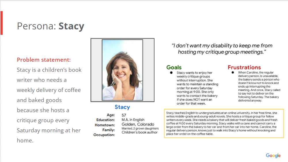
I created two personas to represent the users of the McLeo’s Bakery and Cafe app. One of them is a woman who uses a cane and cannot easily pick up her own order. She wants to place a standing order for delivery. The other is a man who works remotely and needs a relatively quiet place to go to do his work. He wants to produce top-level work so he will keep his job and get promoted.


The Initial Designs
After creating a journey map for each of the two personas, I designed three paper wireframes of the app’s home page and one paper wireframe of each of the three subsequent pages in the app. These were the first paper wireframes I’ve ever designed, and I can see a clear difference between them and my later designs, which reflect much more experience.


The Usability Study
Next, I turned my paper wireframes into digital wireframes and then designed a low-fidelity prototype of the first four pages of the app. I conducted a usability study and placed the participants’ feedback into an affinity map.

Ideating and Revising
Based on the results of my usability studies, I made it clear on the home page that this app is designed for teenagers. I also added a message ensuring users that their private information will not be published. In addition, I gave users options for the picture they use to represent themselves. Finally, I added a message thanking users for signing up.

Responsive Designs
My designs include a high-fidelity prototype for a mobile app (left) and one for a desktop (right).
Takeaways
This was the first design process that I have ever undertaken, and it led me to many new insights. I learned the value of following the design process in order: understand, ideate, decide, prototype, and test. I learned how to avoid bias in my designs, and I learned new strategies for ideating on my designs. For example, I engaged in a Crazy Eights activity, as well as a How Might We activity. I learned about information architecture (IA) and built the IA for three different apps. I learned how Gestalt principles apply to UX design and how to avoid deceptive patterns. I learned how to use Key Performance Indicators to measure the effectiveness of a particular design. I also learned how to create an engaging presentation of my designs for stakeholders.